 ),
Cut (
),
Cut ( 

 ),
Copy (
),
Copy (  ),
Paste (
),
Paste (  ), Delete (
 ), Jump To Program
Designer (
), Jump To Program
Designer ( ).
).The Design Explorer is atool window which displays information about various elements of the touch screen design. The Design Explorer can be used to toggle the visibility of Smart Graphics® Controls (including Pages, Subpages, Subpages References and Subpage Reference List Items), to launch the Sound Manager window, to change the Z-order of subpage references to copy, paste, duplicate, rename or delete Smart Graphics® Controls and to assign join numbers to them.
Additionally, Pages, Subpages, Subpage References and Subpage Reference List Items (SRLI) can be added to the touch screen design directly from the Design Explorer toolbar.
The Design Explorer
also has a built-in right-click context menu and keyboard support for
common functions as: Rename (),
Cut ( ),
Copy ( ),
Paste ( ), Delete (), Jump To Program
Designer ().
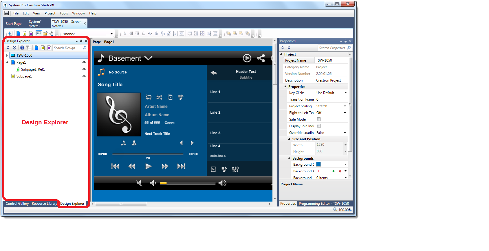
The Design Explorer is displayed by default when Touch Screen Designer opens. As all other tool windows in Crestron Studio® the Design Explorer can be closed/re-opened, pinned to the side of the application or docked, it can also be resized and/or moved to another location in the application window. The Design Explorer and the other Touch Screen Designer tool windows (Control Gallery, Resource Library,Property Grid, Programming Editor) can be stacked on top of each other when docked. When changed, the size and location of the Design Explorer are remembered and displayed the next time you open Touch Screen Designer.
Information displayed in the Design Explorer updates in real time when any Smart Graphics® Controls (including Pages, Subpages, Subpages References and Subpage Reference List Items) are selected, added, pasted, duplicated, renamed or deleted from the touch screen design.
A big portion
of the functionality of the Design Explorer
can be accessed through the Design Explorer Toolbar which provides a quick
and easy way to utilize the following commonly used features:
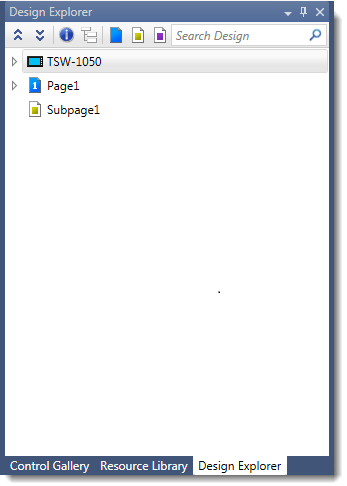
|
Icons |
Purpose |
|
'Collapse
All' |
|
|
'Expand
All' |
|
|
'Show
Details' |
|
|
'Advanced
View' |
|
|
'Add
Page' |
Adds a new Page to the design |
|
'Add
Subpage' |
Adds a new Subpage to the design |
|
'Add
SRLI' |
Adds a new Subpage Reference List Item to the design |
|
|
Elements in the Design Explorer are displayed in a tree-view hierarchy. Additionally, items in the Design Explorer structure are also organized in item groups as applicable. Each item groups can be expanded to display additional items and or collapsed to hide them:
To expand an item group, click the
 to the left of the item group name or press
 .
All
items in that node are expanded.
.
All
items in that node are expanded.
To collapse an item group, click
the  or press
  to collapse that node.
At the root of the Design Explorer hierarchy is the touch screen design item group, which includes the Sound Manager and Global Hard Buttons (if any).
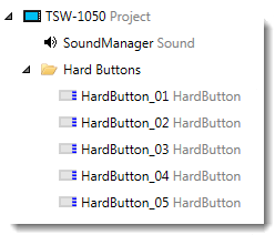
The number of Global hard buttons displayed in Design Explorer matches the number of buttons present on the physical touch screen. For example a TSW-750 design will have 5 hard buttons, but a TST-902 and any logical touch screens such as Crestron App or XPanel 2.0 (Web) will have none. Note that hard button entries shown in Design Explorer also correspond to the Faceplate buttons.
 Are hard buttons local to the page displayed in Design Explorer?
 Global Hard Buttons and
Page-specific Hard Buttons (if any) are
displayed in the Design Explorer. However,
all page hard buttons can be shown in Design
Explorer by selecting the 'Show all Hard Buttons' item in the context
menu of the page:
Global Hard Buttons and
Page-specific Hard Buttons (if any) are
displayed in the Design Explorer. However,
all page hard buttons can be shown in Design
Explorer by selecting the 'Show all Hard Buttons' item in the context
menu of the page:
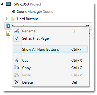
Note that even when “Show All Hard Buttons” is enabled, any page buttons using the global settings will remain grayed out and un-editable in Design Explorer. Unchecking the 'Use Global Setting' property to a page button will assigns a new page-specific Press Digital Join for that hard button.
The First
Page (denoted by the  icon)
always occupies the top-most position below the root. After the First Page, the Design
Explorer hierarchy lists all other pages (marked with the
icon)
always occupies the top-most position below the root. After the First Page, the Design
Explorer hierarchy lists all other pages (marked with the  icon) in the touch screen design (including any Subpage References
  to that page), followed by the Subpages (
 icon), and the Subpage
Reference List Items (
icon), and the Subpage
Reference List Items ( icon). Pages, Subpages and Subpage
Reference List Items are displayed in the Design Explorer in descending
alphabetical order.
icon). Pages, Subpages and Subpage
Reference List Items are displayed in the Design Explorer in descending
alphabetical order.
Can I designate new First Page in Design Explorer?
A page can be designated
as a First Page from the Property
Grid or from the context menu in Design
Explorer.
To designate a First Page in Design Explorer:
Select a Page in Design Explorer
Click on 'Set as First Page' item in the context menu: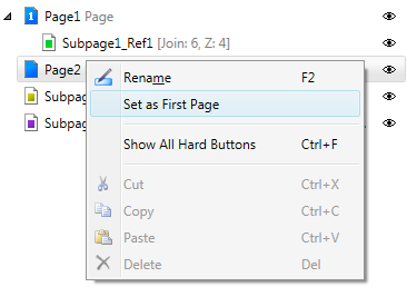
Design Explorer updates in real time to display the new First
Page .
Is
it possible to create a Subpage Reference in Design Explorer?
Yes. it is. To create a Subpage Reference in Design
Explorer follow the steps below:
Select the Subpage in Design Explorer
Drag and drop it onto the desired Page
In a similar way (only applicable if there are more than one Subpage References to a Page) you can also change the Z-order of Subpage References:
Select the Subpage in Design Explorer
Drag and drop it higher/lower in the hierarchy of Subpage References to lower/increase its Z-order
Selection in Design Explorer
Selection of an item in the Design Explorer (or Workspace) displays the item's properties in the Property Grid. For example, clicking on the hierarchy root in Design Explorer shows the current design project-level properties in the Property Grid. Additionally, 'selection adorners' (in yellow for Pages, Subpages and Subpage Reference List Items and in black for all other Smart Graphics® Controls) are shown around any selected item:
To select multiple items in Design Explorer:
Click on the first object to select it.
Press and hold while clicking on each object
you wish to select.
Changing item's visibility in Design Explorer
There are several ways to change the visibility of an item in Design Explorer:
By double clicking on the item
By
toggling on/off the "eye" icon 
By dragging and dropping the item from Design Explorer to the Workspace .
Renaming items in Design Explorer:
Changing the name property (up to 240 characters) of a control allows it to be more easily distinguishable and user friendly.
To rename control:
Select a control in Design Explorer and then choose 'Rename' from the context menu
- or -
Select
a control and press
The new control name is also updated in the Property Grid and Programming Editor, and vice versa.
You can also cut/copy/paste/delete/duplicate any selected Smart Graphics® Control(s) in Design Explorer. Items can be deleted individually or multiple controls can be selected and deleted simultaneously.
To cut/copy/paste/duplicate/delete Smart Graphics® Control(s):
Select the desired object(s) in the Design Explorer
Press the to cut,
to copy,
 to duplicate,
to paste,
or
key to delete the selected item.
to duplicate,
to paste,
or
key to delete the selected item.
-or-
Right-click on the selected item(s) and choose the appropriate option from
the menu that appears: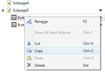
Note that when copy/pasting/duplicating In Design Explorer within the
same system, programming associated with touch screen joins, join
commands (related to control join) and dynamic text will be pasted
to the new control during the Paste/Duplicate operation.
Can I assign joins to Smart Graphics® Controls
in Design Explorer?
Yes, joins
can be assigned in Design Explorer by using the Click
Assign functionality. To do so:
Activate Click Assign Mode
Make the desired Selection in the Click Assign Joins dialog
Once in Click Assign Mode, the mouse cursor changes to a hand pointer icon. Simply position the mouse cursor over each Smart Graphics® control in Design Explorerand click on it.
Note that only the most recently click-assigned item will show selection adorners.
Additionally, selecting any Smart Graphics® Control with
assigned join and pressing
will "jump to"/open Program
Designer with that join/symbol focused.

 Collapses
all items in the Design Explorer
Collapses
all items in the Design Explorer icon
icon


